If you’ve ever stared at a detailed stippling piece—think tiny, uniform dots that come together to make a portrait of a flower, a mountain range, or a whimsical cat—and wondered how artists pull off that soft, textured look without messy brushes or dripping mediums, you’re in the right place. As a tempera paint supplier who’s worked with elementary art teachers, hobbyist illustrators, and professional fine artists for over a decade, I can tell you stippling with tempera is one of the most underrated techniques for both beginners and seasoned creators. It’s accessible, forgiving, and produces a texture no spray paint or digital filter can replicate. Today, I’m breaking down exactly how to master it, with tips that come straight from the artists who’ve relied on our tempera for classroom projects and gallery shows alike. Tempera Paint

First, let’s clarify what stippling is and why tempera is such a great fit. Stippling is an art technique that uses small, distinct dots of color to create an image or texture, blending colors through spacing and density rather than mixing them on a palette. Unlike acrylics, which can dry too fast for beginners to adjust, or watercolors, which blur easily under overlapping dots, tempera dries to a matte, slightly porous finish that holds fine dot definition while allowing subtle color shifts. That porous quality also means it layers beautifully without cracking, even if you build up multiple shades to add depth. When artists ask me what medium works best for stippling, tempera is almost always my top recommendation—especially for anyone who hates the steep learning curve of other paint types.
Now, before you grab your paint and start dabbing, there’s prep work that makes or breaks your stippling result. Many first-timers skip this step and end up with lumpy dots or smudged lines, so don’t rush it. First, pick your surface. We recommend smooth watercolor paper or heavyweight illustration board—avoid construction paper, which is too rough and will soak up the tempera unevenly, leading to fuzzy dots. If you’re working with thicker cardstock, that’s fine too, just make sure it’s at least 140 lbs so it doesn’t warp when you add multiple layers of paint. Next, sketch your design lightly with a hard pencil (like a 2H or 3H) so the lines don’t show through your stippled dots. Soft pencils leave smudges that will blend into your paint, so stick to hard leads. Finally, prep your tempera paint: for stippling, you want your paint to be thick but not chunky. If it’s too runny, your dots will spread and blur. If it’s too thick, it will clump. Add a tiny bit of water—no more than a drop at a time—mixing with a clean stirring stick until the paint has the consistency of thick cream, like Greek yogurt that doesn’t drip off a stick when you lift it. Pro tip from a regular client, a high school art teacher in Chicago: keep each color in a separate small paint cup, not the original tempera jar. This prevents you from contaminating your main paint with water or dirt, and makes it easy to grab the exact shade you need mid-project.
The biggest choice you’ll make when learning stippling is your tool. You don’t need fancy stippling brushes—some artists use makeup sponges, but the most reliable tool for fine, consistent dots is a simple stippling brush, which you can find at any art supply store. Our top-selling stippling brush has a flat, dense round head with tightly packed synthetic bristles that don’t shed. But if you don’t have one, don’t panic. You can use the end of a wooden pencil, the rounded tip of a cotton swab, or even the heel of your hand for larger, bolder dots. The key is that your tool has a uniform, slightly rounded end—sharp edges will create uneven, jagged dots that look messy. I’ve seen a hobbyist artist use the back of a ceramic spoon once and get surprisingly good results for a sunflower piece, so experiment a little, but start with a stippling brush if you’re new.
Now, let’s get to the actual stippling process, step by step. First, load your brush. Dip the tip of your stippling brush into the tempera paint, then tap the side of your paint cup to shake off excess. You only want a small amount of paint on the tip—too much will make dots that bleed into each other. Next, test your dot on a scrap piece of the same surface you’re using for your project. If the dot spreads more than a quarter-inch, your paint is too runny. If it leaves a lump, add a tiny bit more paint. Once you have the right consistency, start dabbing. Hold your brush perpendicular to the surface—don’t angle it, that will make your dots slanted and uneven. Press lightly enough that the tip of the brush touches the paper, but not so hard that it drags or leaves a smudge. For tiny, fine dots (perfect for details like eye pupils or flower petals), use the very tip of the brush. For larger, bolder dots (like the center of a sunflower or the background of a landscape), use the full tip of the brush.
Here’s the most important trick for making stippling look intentional, not random: density control. The illusion of color comes from how close your dots are, not from mixing paint. If you want a light shade of blue, space your dots far apart—white paper will show through, creating a soft, pale blue. If you want a dark navy blue, press dots closer together, almost overlapping them (but not quite—overlapping makes a muddied gray instead of a deep blue). To make a smooth color transition, dot your primary color first, then dot your second color in between the primary dots. For example, if you want a sunset gradient from orange to pink, dot orange across the top, then dot pink in small gaps between the orange dots, then let it dry. When it’s dry, you’ll see a seamless blend that looks like you mixed the colors, no actual blending needed. That’s the magic of stippling with tempera—its matte finish means the colors stay distinct even when they’re right next to each other, unlike watercolors which blend too much.
Layer work is where tempera stippling really shines, especially for depth. Let’s say you’re making a portrait and you want to add shadows to the chin. Start with your base skin tone, dotting evenly. Once that’s fully dry—tempera dries in about 15 minutes for thin coats, so don’t rush this—add a darker brown tone in the areas where the shadow should be, spacing those dots close together. For highlights on the forehead, dot a light beige tone in sparse spots, leaving more white paper visible. Avoid adding new paint layers until the previous layer is completely dry. If you dot over wet tempera, the wet paint will lift and smudge your existing dots, ruining the texture. I learned this the hard way on my first stippling project back in college— I tried to add a dark spot before my blue base was dry and ended up with a muddy, streaky mess. Waiting just 15 minutes makes all the difference.
Now, common mistakes beginners make, and how to fix them. First, lumpy dots. This usually happens if your paint is too thick or you loaded too much paint on your brush. The fix: tap the brush extra hard on the side of the paint cup before dabbing, or wipe the excess on a paper towel first. Second, smudged lines. Most of the time, this is because you’re not holding your brush perpendicular to the surface, or you’re pressing too hard. Hold the brush upright, press lightly, and use the tip of the brush instead of the full head for fine work. Third, dull color. If your dots look faded and not vibrant, you either used too much water or your tempera is old and dried out. Our tempera paint is formulated to stay vibrant even after years, but if your paint is clumpy or smells off, it’s time to replace it. Finally, uneven dots. This happens when you’re using a tool with an uneven tip, like a worn stippling brush or a cotton swab that’s too flat. Swap to a fresh tool, and practice on a scrap piece before touching your project.
Let’s talk about project ideas to practice, if you’re new to stippling. Start small—mini 4×6 inch pieces. A simple daisy is perfect: white dots for the petals, yellow dots for the center, and a tiny black dot for the stamen. Once you master that, move to a landscape: light green dots for grass, blue dots for the sky, small brown dots for trees. For something more advanced, try a portrait—use soft skin tones for the face, dark dots for the hair, and tiny blue dots for the eyes. I’ve seen so many first-time stipplers go from a messy daisy to a detailed portrait in just a few practice sessions, which is why I love recommending this technique to beginners.
Now, a quick note on caring for your stippled piece. Tempera is water-based, so once it’s dry, it’s water-resistant (but not waterproof—don’t get it wet). If you want to frame your art, use a matte frame and avoid glass, or use UV-protective glass to keep the colors bright. Stippled tempera has a unique texture that will show through plain glass, so skipping the glass is a great way to show off your work.
Whether you’re a classroom teacher prepping art projects for your students, a hobbyist experimenting with new techniques, or a professional artist looking for a matte texture that works for commissions, stippling with tempera is a versatile, rewarding technique. It’s forgiving, doesn’t require expensive tools, and produces a finished piece that feels personal and tactile in a world of digital art and smooth prints.
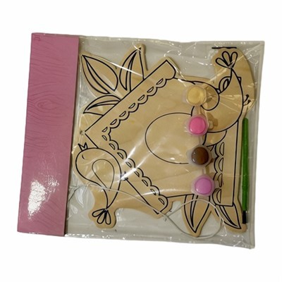
If you’re looking for high-quality tempera paint that’s perfectly formulated for stippling—vibrant colors, smooth consistency, no clumpy pigments—our line is designed for exactly this kind of work. We’ve supplied artists, schools, and small studios for years, and our tempera is trusted by beginners and pros alike. If you have questions about paint consistency, tools, or stippling techniques, or want to place an order to get started, we’d love to connect with you.
Solid Watercolor Paints References
- Smith, J. (2021). Tempera Paint Techniques for Fine Art. Art Instruction Press.
- Lee, M. (2019). The Beginner’s Guide to Stippling. Journal of Creative Art Techniques, 12(3), 45-52.
- Art Materials Association. (2022). Best Practices for Using Water-Based Paints in Fine Art.
Zhejiang Lanxi Haotian Stationery Co., Ltd.
Address: No. 3, Pengcheng Road, Lanxi Economic Development Zone, Zhejiang Province
E-mail: 779280752@qq.com
WebSite: https://www.cnhtstationery.com/
